

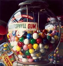
Through the entire year I have been working on a Unite called Visual recording in Art and Design, this has been an extremely fun assignment to do. It involved recreating a variety of Artists, sculptors and drawings, some of the artist I looked at were Alison Watt, Charles Bell, Damian Hirst and Mozart Guerra just to name a few, but Charles Bell is my favorite. Charles Bell is a Photorealist artist (some one who paints realistic panting’s from photos), creating realistic metal (wind up toys) and or glass toys (marbles and gum ball machines), by using the right shades of colour the artist was able to achieve a reflective texture of the metal and glass toys. Combining with the excellent use of lighting, which gives a dramatic and breath-taking look. I also like the bright vibrant look giving the toys a fun and whimsical feel to them.
Here are a few examples of his work.


Another element of work that I did in this assignment was a lot of observational drawing for practise and research. I drew match box’s in three various positions, I also drew body parts like the hand, feet, eye and a few skeletons just to mention a few. My favorite drawings are the hand, rope and skeleton foot. The hand was the hardest of the three as it had so much miniature details and slight curve that from the individual digits, but what made it really hard was that I had to do it in pen and the hand had to be holding an object (I choose my phone as it was on hand lol) to accomplish this drawing I had to first draw the hand in pencil to make sure I got the proportions right, then I went over with pen every thing about the hand came out great the only element I got wrong was the phones shadow as I picked up the pen before the pencil. The rope was also done in pen and approached the same way as the hand but there was a lot more fine detail and patterns that criss-cross the entire drawing.


The skeleton foot came out really well it was done using only pencil. I was able to capture a great composition of the foot making it easier to add a lot of detail to it and it really stands out, the only thing was I never got around to finishing the whole leg, But I like the drawing the way it is as it brings greater focus to the foot and leaves people who see it wanting more.
Movements in art power point
various research
Christopher Marley beetle
In class today we were asked to create a Beetle based on Christopher Marley works, but using three different artist works for the colours of the shell.
Firstly I selected the three artists, which were Henry Roussou, William Morris and Vincent Van Gogh. I selected five pieces of art. One of them being starry night by Vincent van Gogh, two tapestry designed by William Morris and two pieces of art from Henry Roussou called Jaguar Attacking a Horse and traumgarten and applied them under the Beetle template provided.
Once I had arranged all the art in the composition I wanted, I used the eraser tool with a soft edge with the opacity lowered too about twenty-one percent and I went around the entire beetle, blending all the images together until each of the joins on the beetle template to look like one image. Once that was done I then started using the dodge tool which lightens the image, along with the Burn tool which darkens. I used these tools in unison to create various forms of tones that makes the over all image 3D with the main source of light emanating from the top left direction, near to the front left leg of the beetle.
Doing this makes the design really pop out from the page. During the toning process there were a few areas to note, one was the places were the armour shell of the beetle meet with another segment. I did this to add tone. I also had to add tone to the legs as well. Once I had finished I then applied a shadow to my beetle by making a copy of my beetle and using the Hue and Saturation tool, I then set it to minus one hundred applying a Gussian Blur . Next I added it to the layer underneath. Finally I added a small box and using a handwriting type face I created a specimen label with all three artist I used in.


I was extremely happy with this outcome. I enjoyed creating the image if I were to redo this task I would try using different artists. , I would also go even further with the tone’s to make the insect even more alive this was a fun task to do from start to finish.There are a few improvements I could have made like I could have made it more 3D by utilizing the dodge and burn tool and to drop a shadow underneath.
opinion on starry night Vincent Van Gogh Starry Night
Henry Rousseau google doodle
Henry Rousseau born 1844 – 1910 was a French Post- Impressionist painter, he was well known for his paintings of jungle scenery even though he never left France and got his inspiration from illustrated books and botanical gardens. His style of art is rather flat, there is little to no 3D in any of his works, but he has a lot of depth in his paintings with the canopy’s receding into the distance.

His panting’s also have a soft like texture to them, as there isn’t any sharp or bright colours and the ones he does use are just dipping in to the dark versions of the colours which faded of in the distance. Some critics who look at his thought it was seemingly childish and people often were shocked and commented that he painted like a child, while others thought there was sophistication with his own technique and from the 1866’s he regularly exhibited at the Salon des Independents.


For my doodle I was given the artist Henri Rousseau to use as a base for my design. To start o I searched the Internet finding large and good quality images that I could use, then taking two type of grass from two different images to create the foreground. I also made sure one of the grass images had the artist signature and to add some depth to the fore ground I adjusted the brightness and contrast to the tall grass. This was done using the lasso and magic eraser tool.
The next step for my design was to create the Background so I found one of the artist painting which was set at night with a silhouette trees Scout attacked by a tiger and applied it behind the many layers of grass from other pieces of his art (Fight Between A Tiger And A Buffalo) I then also made the background darker to add more depth and perspective. I also started finding shapes within Henri’s paintings that look like the letters of Google. After finding suitable shapes I started to arrange the composition of each shape so that sit nicely between the foreground and the background as well as each other and then I applied an after glow effect behind each shape of the letters, this was by duplicating the shape (on its layer) then changing the duplicated layer Hue and Saturation to + 100 so that it became completely white then I applied a Gaussian Blur and to make the glow brighter I just duplicated the duplicated layer.


With this outcome I was really happy with the result and I enjoyed creating it if I were to redo this task I would try a different artist or create a montage of one of the art movement like pop art or serial.

Visual Recording in Art and Design Spider man stamp
For the main project in this assignment I was tasked to create a stamp based off an Alex Ross works and Steve McQueen (two other artist that I researched) stamps to do this, we each would choose an Alex Ross design and draw it out on a A3 scale then we will apply the stamp border afterwards.
For practice my tutor had us draw a Spider-man (from the Spider-man 3 movie Venom Spider-man) in our sketch books. Drawing Spider-man took a long time which I broke over several weeks, the first hurdle in the drawing was drawing the outline of the body as the finger caused me some trouble as well as the legs, but I found the head and background (rocks and building) easier, probably because they are formed from simple shapes. The webbing design on his suit was extremely hard to accomplish as it was such a small detail trapped within a tight space especially with the fingers (they were even harder to get the details in) thought the main body was the easiest as there was more space to work with and every time I made a mistake I didn’t have to redraw the outline because I accidentally erased the outline along with the mistake (fingers!, arm, leg and head are the exception).
The shading in comparison to the outline was more fun to do, it was a challenge to get the webbing design to stand out from the dark suite, to achieve this effect I would shade and carefully, (with a sharp rubber) erase the webbing design so that it would end being lighter than the rest of the shading. Once the Spiderman was finished I set to work on the background this didn’t end up quiet as dark as I hoped, the actual image was set at night, mine looks like dawn/dusk I still struggle with the darker levels of shading as I handle my pencil too lightly.

The design I chose for my stamp was another Spider-man, this time it was the cartoon version with just the head and in his eyes were The Hulk and The Thing with a dramatic background and a big Adams apple. To help with the process of drawing I drew a grid system over both the sample Image (the one I would copy from) and the paper I would be drawing on. The grid system was there to help keep track of progress and help with the accuracy of the drawing,
I found it really confusing as I kept losing count of the squares and I kept miss counting, so at first my drawing was always loped sided, I got so annoyed at these failings that I stopped using the grid system, once the basic outlines of the drawing was finished. The only time I used the grid was when I stopped drawing (for a break) and needed to work out what I was doing. The Spider-man was a bit difficult especially the two figures in the eyes, the space I had to draw in was extremely cramped and I kept going over the boundaries in my eagerness to do I good job. The shading was a lot easer then the first Spider-man drawing but the shading was still at an intense level as it implied a lot of dramatic flare that needed a lot of pencil work (basically the way the pencil is applied to the paper) that I found hard to accomplish, but the end result came out really well.


Alex Ross Vincent van Gogh power point about two different artists
